Wednesday, June 29, 2011

Celebrate with a Pina Colada

As promised, here's a project with Friday's free Pina Colada digital stamp.  Even the card looks cool and refreshing!

The Details:
  • When creating my challenge entry for last week's Grungy Monday technique, I wondered what light paint colors would do to the look.  Knowing that I wanted a light and summery palette for this card, I used a scrap of pastel checkerboard background paper as the base.  I then used a smaller checkerboard stamp for the clear embossed image.  For the paint, I used white to keep things light and mimic the frothiness of the pina colada. 
    • The white paint works with the technique just as well as the black/brown color Tim used.  This is such a great way to alter that scrap background paper that you might not like anymore, but still have a lot of!
  • The pina colada image was printed on PTI Lemon Yellow cardstock and colored with SU! watercolor crayons.  The white areas are just white acrylic paint...again, I wanted the frothiness of a real pina colada to translate to my image.
  • The finishing touches were just some ribbon, gel pen doodling, and 'Celebrate' stamped in white pigment ink.
This yummy card will be perfect for a summer birthday!  If you haven't already grabbed the Pina Colada digi, remember that it's only free until Friday.


Supplies:
Paper
: SU! cardstock ‘Almost Apricot’; PTI cardstock ‘Lemon Yellow’; Colorbok ‘Checkers’ background paper
Image: Pina Colada digital stamp by Paper Squirrel
Stamps: SU! ‘Checkerboard’, ‘All Year Cheer’
Inks: Top Boss embossing ink; Folk Art acrylic paint ‘901 Wicker White’; SU! watercolor crayons; SU! Craft ‘White’; white gel pen
Embellishments: clear embossing powder; Making Memories ribbon ‘Animal Crackers’

Tools: embossing powder tray; heat gun; tweezers; water pen; foam tape; mini mister; Exacto knife

Tuesday, June 28, 2011

Challenges Entry: Hello Card

Hello, hello...I don't know why you say good-bye, I say hello... 
Great, now that song is stuck in my head! :-)

I'm combining challenges again this week with this Hello card:  Grungy Monday 13:  Alcohol Inks & Simon Says Stamp & Show a Word.

The Details:
  • I've had Ranger's Gloss Paper for a loooong time, but hadn't experimented with it yet.  When I saw this week's GM13 challenge, I knew it was the perfect time to bust it open.  I have to say, Tim Holtz made it look really easy to get a gorgeous background with just a few drops of alcohol ink and a felt blender in his tutorial.  I, however, ended up with a splotchy, ugly mess.  Maybe I was working too large for my first go.  Or, I don't have the magical powers of Tim.  But, I was NOT going to be defeated by a piece of paper!  I blended, I pounced, I blended and pounced some more.  Then, in desperation, I just dribbled the ink directly onto the paper...and ahhh, success!  I love the effect of the ink blots!
  • The flowers and "Hello" are stamped using StazOn Jet Black.  Make sure to always use a permanent ink when stamping on glossy paper.  Press gently and take care...the ink wants to slide on the slick surface and you could easily end up with a smeared image.  Which would be a real bummer after all that blending and pouncing!
  • The rhinestone flower centers were originally clear, but I used alcohol ink again to color them to match.

Supplies:
Paper
: PTI cardstock ‘Kraft’; Ranger Gloss Paper; scrap background paper
Stamps: K&Co Amy Butler ‘Lotus Flower’; SU! crackle background; Inkadinkado
Inks: Alcohol Ink ‘Aqua’, ‘Sandal’, ‘Mushroom’, ‘Salmon’, ‘Red Pepper’, ‘Oregano’; Alcohol Blending Solution; StazOn ‘Jet Black’; SU! Craft ‘Tempting Turquoise’
Embellishments: rhinestones; Making Memories ‘Animal Crackers’ chenille rick rack

Tools: felt ink blending tool; adhesive; tweezers; TH paper distresser; stapler & staples

Monday, June 27, 2011

Summer Vacation Scrapbook Pages - Day 3

And finally...August 2009 vacation #3!
As their 50th anniversary gift wish, my parents asked for nothing more than a family trip with all the kids and grandkids.  After some stressful planning, we settled on a weekend in cabins in Tawas, Michigan.  It rained most of the weekend and was not warm enough to swim...typical.  But we made our own fun with games during the rain and nature walks when the clouds parted.

At least I can say I got in the water...

It's stuff like this that makes me a very slow scrapbooker...  I can't help myself, I see each page as a little canvas and I strive to make something special about it.  On this one, the handcrafted "Beach" sign turned out just so cute.  The sand, grasses, and post are all scrap papers cut, torn, and folded to create the right look.  The top of the sign is a chipboard arrow shape.

Whew!  That was a lot of vacationing...by the time August was over, I was actually glad to be back to work and a normal routine...how sad is that!?

Sunday, June 26, 2011

Summer Vacation Scrapbook Pages - Day 2

Continuing with the Traverse City, Michigan area trip with these pages.  On this day of the trip, we visited Sleeping Bear Dunes National Lakeshore, a beautiful and amazing stretch along Lake Michigan.
Full layout

Left page
Right page

The drop to the lake is astounding...450 feet!  You just can't image it until you've been there.  Seriously...I was NOT going down that hill!
I love journaling on vellum for my scrapbook pages.  It's so unobtrusive and you can still see a hint of the background.

Another section from a travel brochure / magazine telling the story of Sleeping Bear.  The color and size was perfect, so why retype?  The map on the right page is also from the brochure.

We had a great time "up North" on this trip.  Truly such a beautiful area of Michigan!  Tomorrow, I'll wrap up my August 2009 summer vacations scrapbook pages.

Saturday, June 25, 2011

Summer Vacation Scrapbook Pages

In addition to cards, tags, collages, etc., I also scrapbook and since I haven't yet shared any layouts, I thought I'd start with some summer ones. 

August 2009 was a month packed full of vacations for me...in fact, I took three!  Now, normally, I would not plan these things on top of each other, but when you're dealing with mulitple people's / family's schedules, you take what you can get!

#1 
The first vacation is my usual week at my sister's house "up North".  She lives on a beautiful natural lake and we spend the week crafting, swimming (if the weather cooperates), walking the trails, shopping in town, etc.  This week is total relaxation and fun...we don't usually take pictures because, well, we don't do much with ourselves unless we're going into town!  So, no scrapbook pages for this one.

#2
The second was a trip to the Grand Traverse Bay region of Michigan's upper lower pennisula.  It is gorgeous there!  And if you like wine...specifically white wines...this is a place you want to visit!  While there, we took a sunset dinner cruise on the bay on the schooner Manitou. 
Full layout
  
Left page
Right Page

I love adding pieces of memorabilia like this advertisement clipping from a tourist magazine that I picked up during the trip.

During the sail, it rained just enough so that a rainbow formed.  It was beautiful...can you see it?

More layouts from this trip and from Vacation #3 coming in the days ahead.
Do you have summer travel plans?

Friday, June 24, 2011

Free Digi Friday: Pina Colada

Woohoo, it's Friday! 
We made it through another week and it's time for a new free digital stamp.  I'm continuing with the beverage theme from last week with this Pina Colada.  Doesn't it look refreshing?  Perfect for summer or tropical theme projects.


**EDITED**
Friday Free Digis are free for one week. This digital stamp is now available for purchase. To order, go to the side bar, enter the stamp name shown below and click 'buy now' to pay via Pay Pal.

Cost: $2.00
Stamp Name: Pina Colada
I will email you the file once payment is received.

Hope you have a fun and relaxing weekend planned...maybe some Pina Coladas worked in there somewhere!  ;-)

I'll have a project using this digi in the coming week. 

Also, just a reminder that Friday Digis are now only free for one week, so get it while it's hot...um, I mean cool!

Wednesday, June 22, 2011

Challenges Entry: June Coaster Art

Sharing a "twofer" challenge entry today.  This one features another technique from the ever fabulous Tim Holtz and is my submission to Studio L3's Grungy Monday 12.  It also qualifies for Simon Says Stamp & Show Some Metal.

A Few Details:
  • I recently purchased some coasters from Papertrey Ink and have great plans for them.  They are a great weight for a variety of uses and I see many people using them as a type of ATC.  So many ideas, so little time.  (Wish I didn't have to have that "real" job...it really gets in the way of my crafting...LOL!)  Anyway, I used a coaster here as a mini canvas.
  • When creating my version of Tim's technique, I actually used two stamps.  First, I stamped the crackled background, then I stamped the large flourish. 
  • Once both images were stamped in embossing ink, I added clear embossing powder and embossed both images together, creating one unified image.

Supplies:
Paper
: PTI coaster, SU! card stock ‘So Saffron’; scrap background papers
Stamps: SU!; Inque ‘Ornaments’
Inks: Top Boss Embossing Ink; Distress Ink ‘Vintage Photo’, ‘Barn Door’, ‘Wild Honey’; Delta acrylic paint ‘Dark Burnt Umber’
Embellishments: metal bee; metal bee skep; paper flowers; K&Co fabric brad; Bobbin Ribbon; TH tissue tape ‘Nostalgic’; clear embossing powder

Tools: TH paper distresser; foam ink blending tool; glue dots; glossy accents; foam make-up applicator; Tombow Monoadhesive; emery board; heat gun; 3M Super77 spray adhesive


Tuesday, June 21, 2011

On the Craft Table...

Oh, Summer, you are wrecking havoc on my crafting schedule...
This project has been in my head for months and it just hasn't completely made it's way out yet.  Some ideas just need to be "birthed"!  Here's a sneak peek:
My Muse!  Fabulous Graphic 45 "Bathing Beauties" paper.
How I love their papers...such vintage yumminess!!

A blurry peek at another lovely bathing beauty and a letter cut using my Cricut & SCAL,
embossed with a Tim Holtz Texture Fade, highlighted with Distress Ink and Perfect Pearls Mists.

Gee, look ANOTHER beach girl (this one from the Graphics Fairy)! 
Hmm, and real raffle tickets from a weekend crop last fall.

I'm sure by the ladies and the colors, you've guessed my theme!  Can't wait to share the finished project with you, but it's going to take some more laboring...

Monday, June 20, 2011

Techniques: Playing with UTEE

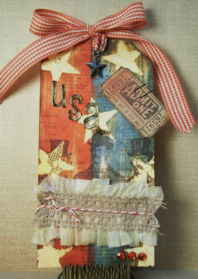
I set out today to see what Ultra Thick Embossing Enamel (UTEE) could do...or, I guess, what I could do with UTEE!  This patriotic tag is one big experiment in playing with UTEE.

The Details:
  • First, I stamped the stars in Versamark onto a manila folder tag, coated them in clear UTEE, and heated from underneath until the UTEE was melted.
  • I then laid the tag on my work surface and reheated each star from above and stamped various images into the melted UTEE.  Leave the stamp in the UTEE until relatively cool.  Note:  I used all red rubber stamps...not sure if this technique is appropriate for clear stamps.
  • Once all the stars were texturized, I dragged Stormy Sky and Barn Door Distress ink pads down the tag to color the background.  I then sprayed the tag with water from a mini mister and let the colors bleed a bit before wiping the tag with a baby wipe in the same direction as the stripes. 
  • Next, I randomly stamped the text in Vintage Photo DI.
  • To bring out the stamped texture in the stars, I daubed Sandal Alcohol ink on each star with a felt applicator pad and then wiped it off with a paper towel.  This removes the alcohol ink from just the surface and leaves the stamped areas colored in.  Wiping off the alcohol ink also dulls the finish of the UTEE, which I really liked for this tag since it's pretty distressed looking.
This star was stamped with handwriting, others were stamped
with polka dots and checkerboard patterns.
The checkerboard star was created by placing replacement screening
into the melted UTEE and using an acrylic block to "stamp" it.
  • After my stars were finished, I stamped Tim Holtz's three gentlemen over the top using StazOn Timber Brown.  Since StazOn is a permanent ink, it stamps right over the top of the UTEE.  I love how you see the pattern and shape of the stars through the men.
  • 
  • After the base was complete, the rest was just embellishing with crepe paper, ribbons, letters, and trinkets, including these alcohol ink and glossy accent-distressed letters.


So there's three UTEE techniques in one tag:
  1. UTEE as a mask
  2. Stamping into UTEE
  3. Coloring UTEE with alcohol inks
I hope this inspires you to do some UTEE playing of your own!


Supplies:
Paper
: manila tag; PTI cardstock ‘Kraft’
Stamps: Tim Holtz ‘Curious Possibility’; SU! ‘Itty Bitty Backgrounds’, ‘Botanicals’; PSX
Inks: Distress Ink ‘Barn Door’, ‘Stormy Sky’, ‘Vintage Photo’, ‘Old Paper’; StazOn ‘Timber Brown’; Versamark; Alcohol Ink ‘Sandal’
Embellishments: metal letters; crepe paper; crochet lace ribbon; PTI Baker’s Twine; Recollections rhinestones; TH mini paper clip; TH star; ribbon; glossy accents; staples

Tools: UTEE; heat gun; tweezers; stapler;
Misc: replacement screening

Sunday, June 19, 2011

Happy Father's Day!

Happy Father's Day to the best dad...my Dad!

I'm so lucky to have such a creative, caring, funny, and talented Dad who happens to have been married to my Mom for the past 52 years.  How rare is that nowadays?!
My Dad and I last Father's Day.

I'll have some fun stuff to share with you tomorrow, but today, I'm spending the day with my Dad and the rest of the family. 

Hope you're enjoying the day honoring the dads in your life!

Saturday, June 18, 2011

Cheers to Dad

Here's a super quick Father's Day card using yesterday's Beer Mug digital stamp. 

Ready, set, go:
  1. Print the Beer Mug digi.
  2. Print your preferred greeting text.
  3. Shop your stash for some coordinating paper scraps.
  4. A little color, a few snips, some adhesive...and done!
The text was printed with my inkjet printer.  You can change up the greeting for a variety of occasions.
  • Here's to another birthday!
  • Here's to a job well done!
  • Thanks...this one's for you!

Supplies:
Paper
: PTI card stock ‘Kraft’; SU! card stock ‘Barely Banana’; scrap background papers
Image: ‘Beer Mug’ digital stamp by Paper Squirrel
Inks: SU! watercolor pencils
Tools: Fiskars corner rounder punch; foam tape

Friday, June 17, 2011

Free Digi Friday: Beer Mug

Wow, 80 followers!!
Thanks to all of you for your readership, support, and lovely comments that just make my day!  Really, I mean it, they make my day!

Well, dear followers, you still have a couple days left to complete your Father's Day cards.  Offer one up in honor of Dad with this Beer Mug digital stamp!  I have a very simple and cute (cute in a manly way, of course) example card that I'll be showing you tomorrow.  Don't worry, it's so simple, you'll have plenty of time to whip one up and give it to your dad on his day! 

**EDITED**
Friday Free Digis are free for one week. This digital stamp is now available for purchase. To order, go to the side bar, enter the stamp name shown below and click 'buy now' to pay via Pay Pal.

Cost: $2.00
Stamp Name: Beer Mug

I will email you the file once payment is received.

 
One little change in the Free Digi Friday format:  starting with this post, all free digis will remain free for one week, after that they will be available for purchase.

TGIF!

Thursday, June 16, 2011

The Rainbow Bridge

Inspired by a Norse legend


By the edge of a woods, at the foot of a hill,
Is a lush, green meadow where time stands still.
Where the friends of man and woman do run,
When their time on earth is over and done.
For here, between this world and the next,
Is a place where each beloved creature finds rest.
On this golden land, they wait and they play,
Till the Rainbow Bridge they cross over one day.
No more do they suffer, in pain or in sadness,
For here they are whole, their lives filled with gladness.
Their limbs are restored, their health renewed,
Their bodies have healed, with strength imbued.
They romp through the grass, without even a care,
Until one day they start, and sniff at the air.
All ears prick forward, eyes dart front and back,
Then all of a sudden, one breaks from the pack.
For just at that instant, their eyes have met;
Together again, both person and pet.
So they run to each other, these friends from long past,
The time of their parting is over at last.
The sadness they felt while they were apart,
Has turned into joy once more in each heart.
They embrace with a love that will last forever,
And then, side-by-side, they cross over… together.
© 1998 Steve and Diane Bodofsky. All Rights Reserved

-----  //  -----

If you're a pet parent, you may already be familiar with this lovely poem.  I post it here today in honor of King Louie Zeus...or just Louie...my sister Cindy's 12-year old bulldog who went to the bridge on Monday.  For those not familiar with the breed, 12 years is very old for a bully.  Louie was so beloved to Cindy.  If you get a chance, please stop by her blog, The Creative Pointe, and send her some love and support...I'm sure she'd appreciate it!

I sent her this sympathy card with a photo of Louie and the Rainbow Bridge poem.  Wasn't he such a handsome boy?  Rest in peace, dear Lou-Lou.


Supplies:
Paper
: PTI cardstock ‘Kraft’; SU! cardstock ‘Confetti White’
Stamps: PTI ‘With Sympathy’ (inside); SU! ‘Warmest Regards’ (inside)
Inks: StazOn ‘Jet Black’
Embellishments: gingham ribbon, PTI rustic button twine; SRM paw print sticker

Tools: foam tape, ink jet printer

Wednesday, June 15, 2011

Organization: Paper Scraps

Since I'm always going on about using up paper scraps, I thought I'd share my organization technique for this.  The key to being able to use your scraps is to have them organized enough so you can quickly put your hands on exactly what you need.  It's taken me several years and versions to perfect this system for myself and I hope it's helpful if you don't yet have a system of your own.

All my scraps are held in this letter-size hanging file box.  There's no particular reason why I went with this particular box style other than I already owned it and it was sitting empty.  If I had to buy new, I would get a solid box with a lid.  And wheels, if possible. However, this box works fine in my studio and is portable, which is key for me since I travel with my supplies a few times a year.

The hanging folders are great because if I know exactly what I need, I can just go to the tab and pull a scrap.  If I need to browse the selection, I can pull the whole folder and leaf through it like a book.

Green folders up front house solid papers and card stock.  All my solids are separated by color family:
  1. Red & Pink
  2. Orange & Peach
  3. Yellow
  4. Green
  5. Teal
  6. Blue
  7. Purple
  8. White
  9. Cream & Sand
  10. Brown & Tan
  11. Black & Grey

Blue folders contain pattern and specialty papers.  These are organized by theme or type:
  1. Floral & Paisley
  2. Novelty & Background
  3. Stripes & Plaids
  4. Geometric
  5. Spring & Summer
  6. Autumn
  7. Winter
  8. Vellum
  9. Mulberry
  10. Metallic
And lastly, red folders hold cardboard.  I use a ton of cardboard in my projects lately and save every kind of box suitable:  cereal, cracker, frozen pizza...if you really pay attention to what you normally throw out, you'll have a stash in no time!

Well, that's my system.  I'm sure I seem quite the type A to you now, but like I said, having your scraps organized means you are much more likely to actually use them.

Tuesday, June 14, 2011

Sewing Spool

I've had a baggie full of random wood parts for a while now.  I think they came from the yearly painting classes I take with my sister...we usually get a goodie bag.  People are always making great stuff out of sewing spools, so when I found one in the bag, I wanted to see what I could come up with. 

It's a pretty small spool...only about an inch high.  In fact, the picture is pretty much actual size on my screen.  The mini dress pattern packaging from Crafty Secrets' "Sew Nice" collage turned out to be the perfect size in relationship to the spool.  With wire, cardboard, hot glue, and some embellishments, I now have a cute little sewing spool art piece.

The Details:
  • First, I added Tim Holtz tissue tape to the center of the spool.  Next, I painted the top and bottom of the spool with TH Antique Linen Distress Crackle Paint, overlapping the tissue tape just a bit.  Once the paint was dry, I added the ruler twill tape and button tied on with embroidery thread.
  • I adhered scrap pattern paper to cardboard, then glued the Crafty Secrets collage image on top.  Using scallop scissors, I cut along the edges, leaving a border of the background paper showing.
  • A length of wire was twisted and hot glued to the back of the collage image.  A second piece of scrap background paper was glued to the back to hide the wire and hot glue.
  • To shim the wire in the spool's center, I rolled a piece of scrap paper to be almost the same diameter of the hole, then inserted it into the hole.  Then, I added hot glue to both the hole and the wire and inserted the wire into the center of the rolled paper/spool hole, holding it plumb until the glue cooled.
  • I used another scrap of decorative paper to mask the hole and hot glue.

Supplies:
Paper
: Anna Griffin background paper
Image: Crafty Secrets Heartwarming Vintage Creative Scraps ‘Sew Nice’
Inks: Distress Crackle Paint ‘Antique Linen’; Distress Ink ‘Tattered Rose’
Embellishments: TH tissue tape ‘Symphony’; Ribbon Trends twill tape ‘Ruler’; mother-of-pearl button; DMC embroidery floss

Tools: foam ink blending tool; hole punch; scallop scissors; glue dots; hot glue gun; wire; wire cutter; needle nose pliers
Misc: scrap cardboard; wood spool

Monday, June 13, 2011

#1 Dad Card

Here's a Father's Day Card idea using Friday's "#1 Dad" free digital stamp.  Pretty quick and simple.  If you haven't made your dad's card yet, you can have this one whipped up in no time.  This card also features the "cracked glass" technique from last week's Papertrey Ink challenge.

The Details:
  • I printed the #1 Dad digi onto PTI Kraft cardstock and colored it using Distress Inks and a water pen.
  • Next, I cut out the image, covered it in Versamark, and layered on several coats of Ultra Thick Embossing Enamel (UTEE).  Keep layering the UTEE until you get a nice smooth surface.
  • After the UTEE is completely cool, I bent the image causing it to crack.  I really liked the light lines the cracks made, so I did not distress them with ink.
  • The plaid paper is from the scrap pile and looks a bit like a man's shirt...perfect background for our tie!
  • Next, I just added some "stitching" with a black Micron pen and a few buttons.
See, nice and quick...so if you still have that Father's Day card to make, get crafting!


Supplies:
Paper
: PTI cardstock ‘Kraft’; scrap background paper
Image: #1 Dad digital stamp by Paper Squirrel
Inks: Distress Ink ‘Crushed Olive’, ‘Stormy Sky’, ‘Barn Door’; Versamark; Micron pen; Sharpie marker
Embellishments: UTEE; buttons; DMC embroidery thread #350

Tools: glue dots; ruler; heat gun

Sunday, June 12, 2011

Challenges Entry: Happy Grunge

I had three challenges that I wanted to participate in this week, but of course I was down to the last day today and figured I better combine them if I wanted to get something submitted! 

They were very easy to combine and I'm calling the result "happy grunge", because while it is definitely grungy a la Tim Holtz, the colors just lift my spirits and make me happy when I look at it. 

The Challenges:
The Details
  •  I started out with a plain manila tag and added stripes of Distress Ink using the corner of the ink pad.  From left to right:  Broken China, Crushed Olive, Peeled Paint, Tattered Rose, Wild Honey, Barn Door, and Vintage Photo. 
  • Once all my stripes were added, I used a mini mister to spray on water to bleed the colors a bit.  While the stripes were still wet, I stamped the text in Vintage Photo.  To speed the drying process, I used a heat gun to dry the inks.
  • To adhere the tissue paper, I covered the entire tag in Matte Mod Podge and pounced on plain white wrapping tissue paper.  Betsy Veldman has a great video tutorial on the whole process at the PTI blog.  As Betsy suggests in the video, I did run my tag through my Texture Boutique to really mesh the tissue to the base.  I guess I used a little too much Mod Podge in areas because my tissue actually turned mushy and lifted during this process, but you know what?  I love the effect!  The extra texture is very distressed and grungy!

  • The pen nibs and sentiment are stamped in StazOn Jet Black. 
  • I stamped the swirls and clock faces in DI on top of the tissue paper. 
  • The starbursts are those little mylar thingies that you see on beaded Christmas ornaments...sorry, I don't know their proper name...but I colored them with alcohol inks and randomly added them to the tag.
  • For just a touch more sparkle, I added some beads to a TH safety pin and attached it to the big bow at the top.


It was so much fun playing with the Distress Inks and tissue paper.  I hope this brings a smile to your face too!


Supplies:
Paper
: manila tag, tissue paper
Stamps: Tim Holtz ‘Curious Possibility’, ‘Life’s Possibilities’
Inks: Distress Ink ‘Vintage Photo’, ‘Old Paper’, ‘Tattered Rose’, ‘Barn Door’, ‘Wild Honey’, ‘Broken China’, ‘Peeled Paint’, ‘Crushed Olive’; StazOn ‘Jet Black’; Alcohol Ink ‘Aqua’, ‘Sandal’, ‘Red Pepper’
Embellishments: Papertrey Ink Baker’s Twine; buttons; mylar disks; beads; TH safety pin; ribbon

Tools: jewelry pliers; tweezers; Matte Mod Podge; Mini Mister; Glossy Accents; glue dots; heat gun

Saturday, June 11, 2011

Challenge Entry: "Howdy" Card

Sharing a card today for Gingersnap Creations GC104 Color Challenge:  Denim, Rust, and Dust.  This rough rider is buckin' by to say "Howdy". 

The Details
  • I've had this denim-look paper for quite a while and decided it was time to cut into it!  That's right...I cut into a new sheet of paper for this one!  This blog & these challenges are such good hoarding therapy for me.  ;-)
  • I've had the wood alphas for a long time.  They fit the card perfectly.  They each have a hole at the top, I suppose to be hung or attached with a brad, but I found glue dots to be the easier attachment method.  The hole looked silly, so I added copper dimensional paint to make them look tacked on.
  • The cowboy image is from the fabulous Graphics Fairy.

Supplies:
Paper
: PTI cardstock ‘Kraft’; denim look background paper; scrap background paper
Image: The Graphics Fairy
Inks: Distress Ink ‘Old Paper’, ‘Vintage Photo’; SU! watercolor pencils
Embellishments: wood alphas; ribbon

Tools: TH paper distresser; Fiskars pinking scissors; glue dots; foam ink blending tool

Friday, June 10, 2011

Free Digi Friday: #1 Dad

I can't believe Father's Day is next weekend!  May in Michigan was so cool and rainy that it seemed more like April and now it just shouldn't be June already. 

Have you made your dad's card yet?  If not, today's "#1 Dad" digital stamp can help.  It's a good one for paper piecing and layering...I bet you can pick out a fun pattern for the tie from your scrap pile!


**EDITED**
Friday Free Digis are free for one week.  This digital stamp is now available for purchase.  To order, go to the side bar, enter the stamp name shown below and click 'buy now' to pay via Pay Pal.

Cost:  $2.00
Stamp Name: #1 Dad

I will email you the file once payment is received.
Like last week, I'll post a project featuring this digi in the coming week, so check back!

Wednesday, June 8, 2011

Enjoy the Journey Mini Plaque

Today's project is a continuation of the Crafty Secrets and sheet music elements I used in yesterday's Roses & Music Birthday Card.  I also added my favorite border SVG from The Creative PointePrincess Border Set.  I like making these mini plaques for seasonal decor in my home or to use instead of a bow on gifts.  Better than a bow...it's pretty and part of the gift!

The Details:
  • I had a lot of fun building up the base on this little plaque: 
    • The structure is two layers of recycled cereal box cardboard cut on the Cricut and glued together, then topped with vintage sheet music. 
    • I then added random areas of thinly-applied Antique Linen Crackle Paint.
    • Once the crackle paint was dry, I applied various colors of Distress Inks to bring out the cracks and add color.
    • On top of all that, I stamped a big swirl in Broken China DI.
  • The bird image is from Crafty Secrets "Birds & Blossoms" collage.  I added glossy accents to just the bird to make him stand out.  I then added gold metallic to his crown and glittered the edges for some extra sparkle.
  • "Enjoy the Journey" was stamped in StazOn Jet Black onto vellum.  I distressed the vellum with Old Paper DI, tattered the edges, and folded it like a pennant.
  • The Princess Border Set SVG is just fantastic, so easy to work into a project and so easy to add embellishments to.  I've used it in various projects now and each one has taken on a completely unique look.  I really wanted a glammed up border for this little plaque:
    • First, I cut the SVG out of PTI Aqua Mist cardstock using my Cricut and Sure-Cuts-A-Lot (SCAL) program.
    • Then I covered the whole border in Rock Candy Distress Crackle Paint
    • While the paint was still wet, I sprinkled on a little aqua and gold fine glitter and crystal chunky glitter.
    • After the paint dried and the glitter was now stuck in the crackle paint, I added Old Paper DI with a foam blending tool to highlight the crackles.  Make sure to pounce the DI on with the foam...don't rub.  Rubbing knocks the glitter off and could tear your border.  The Old Paper DI really gives the border a vintage feel because only the crackle areas without glitter will take the DI.
    • I applied the border to the plaque and then added amber rhinestones to the centers of the diamonds...glitzy, glam, gorgeous!
  • Remember, Cindy's wonderful SVG file sets are available at Diecut Designer.  Make sure you check out The Creative Pointe blog too, she often posts free SVG files!
I love little projects like this one.  I can get really creative and experiment with different techniques and layers without getting overwhelmed by a big space.  I think that's why I've always like making cards so much...they're small too!

Supplies:
Paper
: vintage sheet music; PTI cardstock ‘Aqua Mist’; SU! vellum
Image: Crafty Secrets Heartwarming Vintage Creative Scraps ‘Birds & Blossoms’
SVGPrincess Border set by The Creative Pointe at Diecut Designer
Stamps: TH ‘Playful Journey’; Inque ‘Ornaments’
Inks: Distress Ink ‘Old Paper’, ‘Broken China’, ‘Vintage Photo’, ‘Tattered Rose’; StazOn ‘Jet Black’; Distress Crackle Paint ‘Antique Linen’, ‘Rock Candy’
Embellishments: ribbon, rhinestones, The Art Institute glitter ‘Spring’; JoAnn glitter ‘Crystal’

Tools: foam tape; foam ink blending tool; vellum tape; glue dots; Tombow Mono Aqua glue; postage stamp scissors; SCAL, Cricut Expression

Tuesday, June 7, 2011

Roses & Music Birthday Card

Sometimes the elements of a card or project just call out to each other, don't they?  A friend had given me some antique sheet music a few months ago, right around the time I purchased the Crafty Secrets "Birds & Blossoms" collage.  Never the two had met until the other night on my craft table they longed to create a beautiful card together...and I obliged!  :-)

The Details:
  • Lots of layers of pattern on this card.  The key to layering pattern is to vary the scale and texture.  I used Versamark Champagne Dazzle to stamp the polka dots on the Kraft card stock, very small and subtle pattern.  Then, the biggest pattern in the boldest color...the pink scroll background paper with scalloped edges.  Then a medium-scale pattern in the shape of a torn piece of sheet music.  And finally, the Crafty Secrets collage piece to tie all these lovely layers together!
  • The sentiment is stamped right over the collage image using StazOn Jet Black ink.  I know I've said this before, but I really do love the purity and depth of StazOn inks.  The richness of the ink makes the sentiment stand out from the collage.

  • Tattered Rose Distress Stickles added to just the corners and along the edges of the collage piece add a little bit of vintage sparkle

  • Even the birdie's crown got some extra attention with a gold metallic marker.
  • The imperfection of the mother of pearl buttons just adds to the vintage feel.  The small buttons are threaded with Papertrey Ink rustic button twine and the large sports a pink satin ribbon bow.  The long, flowing tails of the satin bow are twisted and looped and tacked down at intervals.

Supplies:
Paper
: PTI card stock ‘Kraft’; vintage sheet music; scrap pattern paper
Image: Crafty Secrets Heartwarming Vintage Creative Scraps ‘Birds & Blossoms’
Stamps: Fiskars birthday, SU! ‘Itty Bitty Backgrounds’
Inks: Distress Ink ‘Tattered Rose’, ‘Tea Dye’; Versamark Dazzle ‘Champagne’; StazOn ‘Jet Black’; Zig Writer ‘Metallic Gold’
Embellishments: crushed velvet ribbon; satin ribbon; PTI rustic button twine; mother of pearl buttons; Distress Stickles ‘Tattered Rose’

Tools: foam ink blending tool; foam tape; scallop scissors, glue dots, TH paper distresser