Tuesday, May 31, 2011

Challenge Entry: Bird in the Hand

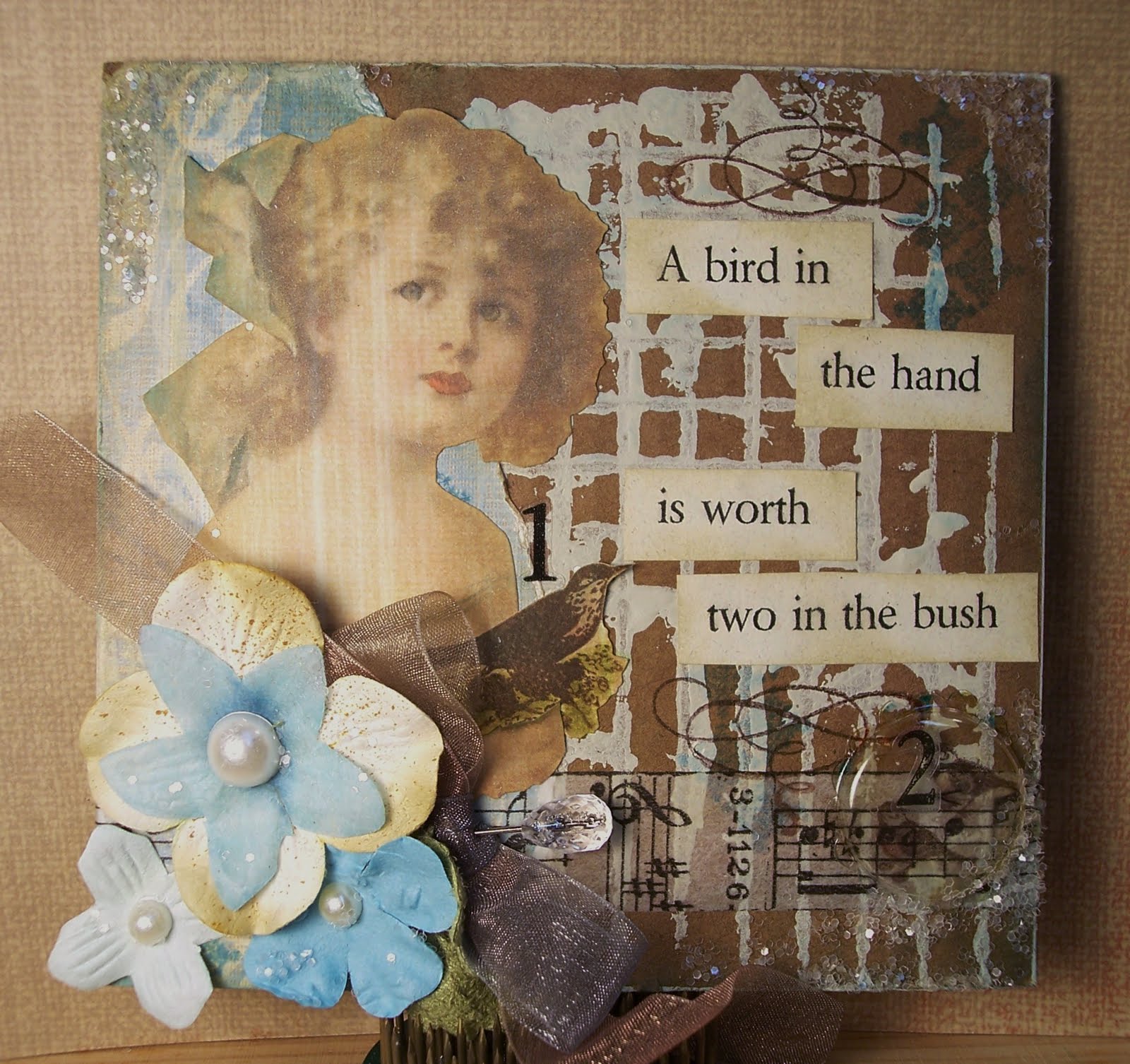
Have you seen the insurance commercial spoofing Antiques Roadshow with the ceramic "bird in the hand" valued at "two in the bush"?  So funny.  And apparently, inspirational.
I had started off planning this project as a two-fer with SSS & Show an old wives' tale challenge from a few weeks ago, but then I realized that my theme wasn't an old wives' tale...it was a proverb that actually refers to falconry...doh!  (Isn't the internet a wonderful thing?)  Sooo...so much for the two-fer, but it still qualifies for my original goal of Inspiration Emporium's We Challenge You to Use: Packaging and I just think it's cute!

The Details:
  • The base was cut from the flap of a corrugated cardboard box that I'm sure contained and transported craft supplies at some point, but contained a kitty at the time I cut into the flap.
  • After trimming to size (approx 4.5" sq.), I tore a paper layer off the leftover piece to expose the corrugations.  I brushed on Delta Raw Linen acrylic paint and used the scrap cardboard to stamp the background grid image onto my project piece.
  • I continued to build the background with images stamped in Broken China DI and also shaded areas with a foam ink blending tool with Broken China.
  • A scrap piece of K&Co decorative paper was torn and added to one edge...more Broken China & Old Paper DI shading added.
  • I then layered up my elements and images:  a strip of TH Symphony tissue tape, the girl image, the bird, and the wording.
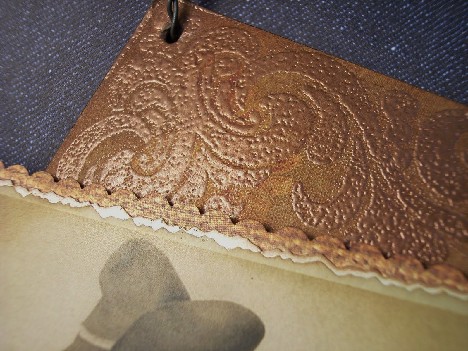
  • For the "two in the bush", I stamped two small birds directly onto the cardboard base using StazOn Timber Brown, then colored them with DI inks and a water pen.  To highlight them and use more packaging, I cut the bubble from a TH embellies package, scalloped the edges, slightly distressed it with Sandal Alcohol ink, and glued it over the top of my birdies using Glossy Accents.
  • After adding the flowers and ribbon, I covered select areas in Matte Mod Podge and added glitter.

So did you count?  That's three unique ways to use packaging in your art:
  1. Cardboard as a base
  2. Corrugated cardboard as a background stamp
  3. Bubble packaging as an embellishment
Could such a pretty little piece really have started life as a cardboard shipping box?  This was such a fun experiment...look around your craft room, your whole house...what can YOU make from packaging?  Renew, Reuse, Recycle!


Supplies:
Paper
: K&Co; scrap background paper
Image: Crafty Secrets
Stamps: My Mind’s Eye ‘Pretty’
Inks: Distress Ink ‘Old Paper’, ‘Broken China’, ‘Barn Red’, ‘Peeled Paint’; Delta acrylic paint ‘Raw Linen’; StazOn 'Timber Brown'; Alcohol Ink ‘Sandal’
Embellishments: Me & My Big Ideas number stickers; pearls; Prima flowers; leaf ribbon; TH tissue tape ‘Symphony’; Maya Road hat pin; JoAnn glitter ‘Crystal’

Tools: glue dots; Glossy Accents; water pen; 3M Super77 spray adhesive; scallop decorative scissors
Misc: corrugated cardboard box; TH embellishments packaging

Monday, May 30, 2011

Poppy Dreams

Today I'm sharing a collage-y piece that I have fallen in love with.  First you should know that I love poppies and I love red...so this piece will have a permanent place in my living room (with my red sofa and other poppy artwork).  It all came about because I wanted to highlight the versatility of Creative Pointe's Princess Border SVG file set.  I cut the border in red with a black shadow and then found the poppy and dreamer images already printed in my stash and the rest fell into place.  Don't you love when a piece just comes together?
(I'm bummed that the photography washed out the poppy a bit...it's actually a much deeper red, more like the lady's cloak.)

The Details
  • The base is a heavy piece of scrap cardboard covered in wood grain paper.  I believe it came off the back of a paper pad.  Waste not, want not!  The project is approx. 5"x7".
  • I cut the Princess Border from scrap red and black card stock, then shaded with Barn Red and Crushed Olive (just a dash) DI.  For a more glitzy border, I added dots of gold with a Zig metallic marker, large red rhinestones, and Xmas Red stickle "gems".  Remember, Cindy's wonderful SVG file sets are available at Diecut Designer.  Make sure you check out The Creative Pointe blog too, she often posts free SVG files!

  • I printed the poppy image twice, adhering the first (full) image over the wood grain paper, then gluing the second image on a piece of heavy card stock.  I cut out just the large poppy blossom from the second image and layered it on top of the first with foam tape.  This is a great way to add dimension.
  • To add even more dimension to the poppy's center, I added dots of Walnut Stain Distress Stickles. 
  • "Dream" was stamped in StazOn Jet Black and colored in with Barn Red and Crushed Olive DI and Zig metallic gold marker.  TH filmstrip ribbon was then layered over the top (positioning so you can still read "dream") using Glossy Accents.
  • To temper all the red (I realized I was getting a bit crazy with it), I added the big green bow and K&Co button brad.

Supplies:
Paper
: Provocraft; SU! card stock ‘Basic Black’, ‘Ruby Red’
Image: Image Compilation & Enhancement ‘The Lady’s Closet’; poppy - unknown (sorry!)
SVG:  Princess Border set by The Creative Pointe at Diecut Designer
Stamps: Inque ‘Ornaments’; Scrappy Cat ‘Designer Flourishes’
Inks: StazOn ‘Jet Black’; Distress Ink ‘Crushed Olive’; ‘Old Paper’; ‘Barn Red’; Encore Ultimate Metallic ‘Gold’; Zig Writer ‘Metallic Gold’
Embellishments: red rhinestones; Stickles ‘Xmas Red’; Distress Stickles ‘Walnut Stain’; K&Co button brad ‘Wild Saffron’; TH film strip ribbon

Tools: foam ink blending tool; TH paper distresser; emery board; glue dots; 3M Super77 spray adhesive; foam tape; water pen; Glossy Accents; Cricut Expressions electronic cutting machine; SCAL
Misc: cardboard

Sunday, May 29, 2011

Challenge Entry: Grungy Monday 08

I've skipped a couple Grungy Mondays, but I thought I'd give Grungy Monday 08's technique a try.  The biggest challenge I had was sorting through my stamp collection to find a suitable image.  I finally landed on an "oldie but goodie", Stampin' Up!'s Terrific Tulips.  The set is a layer set which was fun to play with using Tim's watercolor technique.  I'm pretty happy with the results!

You can view Tim's tutorial HERE.


Supplies:
Paper
: SU! card stock ‘Rose Red’, ‘Naturals White’; watercolor paper
Stamps: SU! ‘Terrific Tulips’, ‘Friend to Friend’, ‘Checkerboard’
Inks: Distress Ink ‘Barn Red’, ‘Tattered Rose’, ‘Crushed Olive’, ‘Stormy Sky’, ‘Broken China’; StazOn ‘Jet Black’; Versamark
Embellishments: PTI rustic button twine; button
Tools: Mini Mister; water pen

Saturday, May 28, 2011

Bee Well!

Sharing a cute get well card today for a friend who recently took a tumble (thankfully, she's fine now).  Sue raises bees, so now whenever my sisters and I see anything with bees, we immediately think of her, so of course, her card had to have a bee on it!

The Details:
  • SU! Barely Banana card stock was embossed using TH Damask texture fade.  The edges were distressed with the TH paper distresser, then Wild Honey Distress Ink (how appropriate!) was applied on the edges and raised areas with a foam blending tool to bring out the pattern.  A speckle background was stamped near the edges in SU! Chocolate Chip ink.
  • The "Get Well Soon" sentiment was stamped directly on the embossed paper, which made me nervous, but a light touch did the trick and it stamped very well...whew!
  • The bee image was stamped in SU! Chocolate Chip, then colored in with Distress Inks and a fairly dry water pen (so as not to bleed the Chocolate Chip ink too much).  To give the bee a little more accent and dimension, a layer of Glossy accents was added just to the body.


Supplies:
Paper
: PTI card stock ‘Kraft’; SU! card stock ‘Barely Banana’, ‘More Mustard’, ‘Naturals White’
Stamps: SU! 'A Quiet Life', 'Warmest Regards', 'Itty Bitty Backgrounds'
Inks: SU! Chocolate Chip; Distress Ink ‘Wild Honey’, ‘Crushed Olive’, ‘Tattered Rose’
Embellishments: PTI rustic button twine; ribbon, button; Glossy Accents
Tools: TH Damask texture fade; Texture Boutique; TH paper distresser; scallop decorative scissors; glue dots


Friday, May 27, 2011

Free Digi Friday: Bride

Yay, it's finally Friday!  And yay, it's a long weekend! 

Today's free digital stamp is a pretty bride with her bouquet.  With June right around the corner, wedding season is gearing up and I thought all of you could find a lot of uses for her...wedding cards of course, but also bridal shower invites, favors, thank yous, etc.

The sample card I created is suitable either for a bridal shower or a wedding.


The Details:
  • Like last week's "Girl with Daisy" digi, I paper-pieced my bride by printing her out three times:  twice on ivory card stock and once on the lace pattern paper.  Her veil is the lowest layer, then her dress, then her arms and head.  Always start with the whole image on the base, then layer up with the pieces you want to highlight.
  • For a little extra something, I used Scribbles dimensional paint to create "pearls" for her earrings and necklace, along the bottom of her dress, and in her bouquet and hair.
  • I also added Tattered Rose Distress Stickles to the roses in her hair and bouquet.

**EDITED**
Friday Free Digis are free for one week.  This digital stamp is now available for purchase.  To order, go to the side bar, enter the stamp name shown below and click 'buy now' to pay via Pay Pal.

Cost:  $2.00
Stamp Name: Bride

I will email you the file once payment is received.

I'd love to see your creations with the Bride or any of my digis...please leave a comment with a link to your blog!


Supplies:
Paper:  SU! card stock ‘Mellow Moss’, ‘Naturals Ivory’; scrap pattern paper
Image: “Bride” digital stamp by Paper Squirrel
Stamps: SU! ‘Wonderful Words’, ‘Botanicals’
Inks: SU! ‘Craft White’; SU! watercolor pencils, Versamark Dazzle ‘Champagne’
Embellishments: Distress Stickles ‘Tattered Rose’; Scribbles Iridescent ‘White Mist’; crochet ribbon
Tools: water pen; EK Success border punch

Thursday, May 26, 2011

Challenge Entry: Buckin' Bronc Tag

The Western theme with Gingersnap Creations continues!  Lots of fun elements worked into this buckin' bronc tag for the GC101: Chestnut Theme Challenge - Cowboys and Cowgirls, including a great border SVG file from Creative Pointe.

The Details:
  • For the wood-like background, I embossed a piece of caramel-colored textured card stock using Tim Holtz wood grain texture fade.  After tearing the top and bottom edges and sanding down random areas with an emery board, I added layers of Vintage Photo and Peeled Paint Distress Inks all over using a foam ink blending tool.  Then random areas were stamped with Vintage Photo and Barn Red using a background speckle stamp.
  • The border was cut using Creative Pointe's Princess Border set that is available at Diecut Designer.  Don't let the name fool you, it's not just for princesses!  Cut from this rusty brown scrap paper, it reminded me a bit of spurs or barbed wire.  Perfect for a cowboy tag!  A touch of Frayed Burlap Distress Stickles on just the fretwork portions plays up the metallic feel.
  • The cowboy image is from Graphics Fairy.
  • The "lasso" is PTI rustic button twine wound up in a loose circle.
  • The boot started out as an ugly beige-ish novelty button, but with alcohol inks, anything can become the right color!  Blah beige became luscious leather with a combo of Mushroom and Sandal alcohol inks.  Nubian metallic rub-on wax added a great patina.

Supplies:
Paper
: PTI card stock 'Kraft'; scrap pattern papers

Image: Graphics Fairy 'Cowboy'
SVG: 'Princess Border' by The Creative Pointe at Diecut Designer
Stamps: SU! 'Itty Bitty Backgrounds'
Inks: Distress Inks 'Vintage Photo'; 'Barn Door'; 'Peeled Paint'; Alcohol Inks 'Mushroom', 'Sandal'; Craf-T metallic rub-on 'Nubian'
Embellishments: PTI rustic button twine; ribbon; twine; Distress Stickles 'Frayed Burlap'; boot button

Tools: glue dots; TH paper distresser; hole punch; ink blending tool; Texture Boutique; TH wood grain texture fade; 3M Super 77 spray adhesive; emery board
Misc: scrap cardboard (cereal boxes)

Wednesday, May 25, 2011

Another Teenage Birthday Card

Since I shared the boys' cards for this year, I thought I'd throw in my niece's birthday card too.  I really like how this one turned out.  Pretty simple, but perfect for the recipient.  Jamie loves bold colors and is an incredible artist herself with modern taste. 

The Details:
  • The journaling lines were stamped with Versamark ink, then the greeting was stamped on top with StazOn Jet Black.  StazOn black ink is one of my favorites because it's a true, deep black with no hint of brown or purple.  And of course, if you want to color your stamped image with markers or watercolors, StazOn will not bleed.
  • The flower center is a large white brad with an orange rhinestone on top.  Just a touch of bling for Miss Jamie.
  • I love the stamped image because she actually looks a lot like my niece...happy coincidence!

Supplies:
Paper
: SU! card stock ‘Naturals White’, ‘Pumpkin Pie’, ‘Pink Passion'; scrap pattern papers  
Stamps:  SU!; Inkadinkado
Inks: StazOn ‘Jet Black’
Embellishments: Darice silk flower; large white brad; orange rhinestone
Tools: Fiskars corner rounder punch; glue dots

Tuesday, May 24, 2011

Challenge Entry: Feelin' Lucky

Howdy ya'll!
This month's theme over at Gingersnap Creations is "Cowboys & Cowgirls" and it has motivated me to create outside my normal subject matter.  C'mon, I live in Michigan...last time I looked, we didn't have any cowboys, but hey, I'm always up to a challenge! 

I found this great poker-playin', gun-totin', sassy gal over at the Graphics Fairy and was inspired to create this Feelin' Lucky plaque for GC101: Chestnut Theme Challenge - Cowboys and Cowgirls.


The Details:
  • The base for the plaque is recycled cereal boxes.  Two layers glued together using spray adhesive forms a stable base for small plaques like this one (approx. 6" x 7")
  • I actually cut into a new piece of background paper for this project!  Can you believe it?  I think it's K&Co paper.
  • To create a faux tooled leather effect, I embossed large flourishes in copper, then rubbed the embossed areas with steel wool when the embossing powder was completely cooled.  This dulls and distresses the finish.   I then added depth with Vintage Photo Distress Ink.  While the DI will not stick to the embossed areas, it fills in where the steel wool left scratches and deepens the color around the flourishes. 

  • Once the lace, twine, flower, and copper brad were added, I felt the need for another metal accent...some sort of trinket.  I searched the stash, and found a copper tag from SU!...bright, shiny copper (like a new penny).  Well, that color just wouldn't do, so I pulled out the steel wool again to knock down the finish, then added Mushroom alcohol ink.  This gave the copper the perfect patina.  The finishing touch was stamping "luck" in StazOn Timber Brown.

Supplies:
Paper
: K&Co; scrap pattern papers
Image: Graphics Fairy 'Cowgirl'
Stamps: Inque Boutique ‘Ornaments’; SU!
Inks: Distress Inks 'Vintage Photo', ‘Old Paper’; Alcohol Ink 'Mushroom'; StazOn ‘Timber Brown’; Top Boss embossing ink
Embellishments: PTI rustic button twine; copper brad; crochet lace ribbon; Prima flower; SU! Copper tag; TH trinket pin; TH copper jump ring; copper embossing powder

Tools: heat gun; 3M Super 77 spray adhesive; wire cutter; TH paper distresser; foam ink blending tool; Fiskars deckle decorative scissors; foam tape; glue dots; hole punch
Misc: scrap cardboard (cereal boxes); wire; steel wool

Monday, May 23, 2011

Teenage Boy Cards - Day 3 & Wrap Up

Today we wrap up the Teenage Boy Card series with Jacob's card.  Jake turned 15 this year (thank goodness all my nephews and niece are always on odd or even ages the same year...it makes it easy to remember how old they are!)  Jake's card is very similar to Cody's that I posted yesterday.  It's great when you have a good basic template or layout and you can make several unique cards just by changing colors and/or a few elements.

The Details:
  • The blue frame is again a chipboard piece colored this time with Stormy Sky Distress Ink.  I love how it looks like denim.  The frame is much larger on Jake's card, so an entire sentiment fits here.
  • Still keeping the embellishments simple and masculine, a metal edge tag with the star stamped on it pulls together the circles from the background and the metal from the brads.


To wrap up the Teenage Boy Cards series, here are my suggestions for "boy card" success:
  • Use elements that highlight their interests (of course, we card makers do this all the time!).
  • Too many embellishments can appear feminine, especially ribbon.  Stick to metal, twine, rustic buttons, etc.
  • Keep it simple.  A good geometric layout can go a long way!
  • Stay grounded.  Be cognizant of the colors you're using...earth tones are best.  Notice that all three of my cards feature Papertrey Ink Kraft card stock.  I am in love with this paper!

Supplies:
Paper:  PTI card stock 'Kraft'; SU! card stock 'More Mustard'; scrap pattern paper
Stamps:  SU!
Inks:  Distress Ink 'Stormy Sky'; SU!
Embellishments:  metal edge tag; JoAnn sticky brads; chipboard frame

Sunday, May 22, 2011

Teenage Boy Cards - Day 2

Continuing with teenage boy card ideas, my next oldest nephew is Cody who will be 17 in June.  I went pretty basic with his card this year.  Too many embellishments can make a card feminine in no time flat! 

The Details:
  • I will rarely cut into a new sheet of decorative paper to make a card (remember, I am the Paper Squirrel!).  I organize my scraps in a variety of folders so that I can easily pull out the appropriate type of paper for the job.  This scrap is playful, but not juvenile.
  • Overall the design is very geometric...just rectangles with everything offset a bit as they cross each other.
  • The green frame is a raw chipboard piece that was rubbed with Forest Moss Distress Ink.  This is a quick way to color chipboard...no covering with paper or waiting for paint to dry!
-- // --

Here's another interpretation of the geometric layout.  This is last year's card when Cody turned 16, hence the car.  Again the elements are all rectangles layered on each other but never centered.  This time though, I corner rounded most of the edges.


Supplies (Happy Birthday):
Paper:  PTI card stock 'Kraft'; SU! cardstock 'More Mustard'; scrap pattern paper; corrugated kraft board
Stamps:  SU!
Inks:  DI 'Vintage Photo'; 'Forest Moss'
Embellishments:  JoAnn stick on 'brads'; chipboard frame
Tools:  foam tape

Supplies (Car):
Paper:  SU! card stock 'More Mustard', 'Naturals White', 'Ballet Blue'; scrap pattern paper
Stamps:  SU!
Inks: SU!
Embellishments:  SU! eyelets
Tools:  foam tape, Fiskars corner rounder punch

Saturday, May 21, 2011

Teenage Boy Cards - Day 1

Oh it's such a BEAUTIFUL day here that I could barely drag myself downstairs to my basement studio!  I did finally get my flowers and veggies planted.  Also spontaneously ripped out a bush that I've hated for years, so a morning well spent!  On to today's project...

So what's harder than creating a "man" card?...that's right, a card for a teenage boy (man)!

I have three teenage nephews and I've really had to strike the balance between fun and grown up in their birthday cards the last few years.  For the next few days, I'm sharing their cards for this year.  Hopefully they'll provide some inspiration for your own teenager cards.

We'll start oldest to youngest.  Calvin just turned 19 and for his card this year, I focused on what he's best know for...swimming. 

The Details:
  • I've had some Hot Off the Press Collage packs for years and have just started browsing through them again.  That's where I came across this swim stroke instruction image.  Perfect for Cal!
  • For some color, I added scrap stripe paper and some blue card stock hand cut to look like waves.
  • It needed a little dimension and the orange buttons did the trick.  I love accenting with buttons!

Supplies:
Paper:  Hot Off the Press collage paper; PTI card stock 'Kraft'; SU! card stock 'Ballet Blue'; scrap stripe paper
Stamps:  SU!
Inks:  VersaMark; DI 'Tea Dye'
Embellishments:  buttons; PTI rustic button twine
Tools:  hole punch; foam tape

Friday, May 20, 2011

Free Digi Friday: Girl with Daisy

Happy Friday, all!
Today's free digital stamp is a cute little lass with a flower for you!  It's a pretty versatile image...use it for birthdays, Mother's Day, sympathy, get well, etc.  I made a thank you card for the sample.

The Details:
  • I paper pieced her dress to achieve the polka dot pattern.  Simply print the image twice...once on plain card stock, once on pattern paper, then cut out just the dress and glue over the top of the card stock image.  You know me and how I love to use up scraps!  Paper piecing is another great way to do this. 
  • The flower is highlighted with a touch of Glossy Accents and a Scribbles Paint Pearl center.


**EDITED**
Friday Free Digis are free for one week.  This digital stamp is now available for purchase.  To order, go to the side bar, enter the stamp name shown below and click 'buy now' to pay via Pay Pal.

Cost:  $2.00
Stamp Name: Girl with Daisy

I will email you the file once payment is received.
Supplies:
Paper:  PTI card stock 'Kraft'; SU! card stock 'Blush Blossom', 'Rose Red'; scrap pattern paper
Stamps:  Girl with Daisy digital stamp by Paper Squirrel; SU!
Inks:  StazOn 'Jet Black'; Martha Stewart craft markers
Embellishments:  PTI rustic button twine; Glossy Accents; Scribbles 3D Paint 'Pearl'
Tools:  foam tape; TH paper distresser

Thursday, May 19, 2011

Technique: Mod Podge Image Transfer

The Graphics Fairy led me to the tutorial for this amazing technique HERE at Distressed Decor and I just had to try it.  This was my first attempt and I will be incorporating this into more projects for sure.   
The Details:
  • I had this wooden bowl in my stash and thought it would make an interesting "nest" with the help of the Graphics Fairy image.
  • First, I painted just the inside and edges of the bowl Wedgewood Green (all paint colors listed are Delta acrylic).
  • Next, I dry brushed on Burnt Umber and Raw Linen for a nice distressed look. 
  • Using an old toothbrush and slightly watered down Raw Linen, I added some speckling by raking my thumb along the bristles so that the paint flies off the brush in small droplets.  This is messy, make sure to set your piece in a cardboard box to prevent over spray.  (I do it in my laundry tub, then just rinse the paint away.)
  • After the paint was completely dry, I followed the tutorial for applying the image with Mod Podge.
  • Once the image was transferred and the paper removed, I applied four additional coats of Mod Podge to the inside of the bowl.  Because I used a concave bowl, my image wrinkled a bit, so I used the several layers of Mod Podge to fill in and create a smooth finish.
  • I wanted the outside of the bowl to keep its natural wood grain, so I just rubbed on black antiquing gel as a stain and used the Mod Podge as a sealer.


Isn't it cute?  I'm going to use it on my bedroom dresser to hold my watch and other trinkets.  Have fun creating with this great technique...the possibilities are endless!

Wednesday, May 18, 2011

Relay for Life Luminaries

For several years now, my sister Cindy (a melanoma survivor) participates in Relay for Life to raise money for the American Cancer Society.  Each year I purchase and decorate luminaries in memoriam of two very special women whom our family lost to this terrible disease:  my grandmother, Clara, and my aunt and godmother, Lucy.  We lost them within a few months of each other, many years ago.

I'd thought I'd share this year's luminaries with you.  It's such a beautiful way to honor those who have battled cancer...those who have lost, those who have won, and those who still battle...

Tuesday, May 17, 2011

I'm a Ginger Gem!

Oh my gosh, I'm so excited!  The Gingers have honored my GC99 Fans Challenge entry by selecting it as a Ginger Gem piece.  The best part is that it was such a fun project and ended up being a gift to my "muse"...my sister, Cindy at The Creative Pointe.

If you missed it, here's photo of my project and you can view the full post HERE.
Thanks so much to the Gingers and all to of you for the lovely comments and support...there's more creations to come!

Monday, May 16, 2011

Technique: DI Watercoloring

Back in February, I took the "Painted Petals" workshop at Archivers and want to share a great technique from that class.  It's a fast and easy way to make it look like you're a watercolor master!  Back in my own studio, I realized that the only stamps that I have that will work are tiny...inchies.  So, undeterred, I decided to make mini gift cards.  There are plenty of times when I send the actual card ahead of time and just need a basic "to/from" card on the gift itself.

The Details:
  • The key to this technique is to use a stamp with a negative image (where the background is the solid stamped part).  
  • Emboss the image with white embossing powder, then color in with Distress Inks using a water pen.  I recommend using a high-quality embossing powder like Zing! to ensure good cover and adhesion.
  • The cards measure 2-1/2" square.  These are a great way to experiment with new techniques and also to use up your scraps!
  • Because the embossed areas define the image and keep you "in the lines", you can watercolor quickly with the end result looking like it took hours and some mad watercolor skills! 
Here are the two cards made at the Archivers' class; these stamped images are much larger scale:


Supplies:
Paper:  PTI cardstock 'Kraft'; SU! cardstock 'Ultrasmooth White'; K&Co
Stamps:  SU! 'Mostly Flowers'
Inks:  Top Boss embossing pad; Distress Inks 'Peeled Paint', 'Tattered Rose'
Embellishments:  ribbon
Tools:  Zing! white embossing powder; heat gun; water pen; adhesive; foam tape

Sunday, May 15, 2011

Challenge Entry: USA Tag

I bought my flowers in the rain yesterday and mother nature is still not cooperating with me actually planting them.  Rain, rain, go away!  (I know I'll be wishing for rain come July.)  The upside to the rain is that I have a great excuse to play in the studio all day.  Today I tackled Studio L3's Grungy Monday 06 Challenge.  I'm a bit ahead on the subject matter, but I realized that I don't have much decor for Independence Day and wanted something to display in July.
I really love the effect of this technique and will be using it again, I'm sure.  You can view Tim's tutorial HERE.

Supplies:
Paper:  manila tag; scrap pattern paper; Hot Off the Press Artsy Collage 'Travel'
Stamps:  PSX; The Peddler's Pack Stampworks
Inks:  Distress Ink ‘Tea Dye’, 'Old Paper', 'Stormy Sky', 'Barn Red'; StazOn ‘Timber Brown’
Embellishments:  Chartwell Studio alpha stickers; buttons; PTI baker's twine; Distress Stickles 'Old Paper'
Tools:  glue dots; ink blending tool; foam paint brush; water pen; adhesive
Misc:  Delta acrylic paint 'Tide Pool Blue', 'Raw Linen'

Saturday, May 14, 2011

Organization: Ink Blending Foam Storage

Okay, so I'm not above changing out my many foam pads on my one ink blending tool to save a buck.  I use my Tim Holtz Distress Inks and the blending tool all the time, but I just haven't felt the need for several tools, or that really nice storage spinner that Tim has.

The problem with this is I had a bunch of foam pads floating around my work table.  There's really not a good way to label them.   I tried writing in Sharpie on the back, but it was barely legible.  And I was constantly sorting through them looking for the right color (geez, multiple tools and that fancy spinner rack that Tim has is starting to sound pretty good...wait, no!).  Well, I came up with the simplest solution.  The pads are attached to the tool with Velcro, right?  So I just put a Velcro dot on the bottom of the ink pads and problem solved!  Now, I pick an ink, rip the foamie off the bottom, attach it to my tool, and go!
I positioned the Velcro so that I would still be able to read the color label.

If you stack your Distress Inks, this may not be the best solution for you.  The foam pad makes them stack a little wobbly.  I keep mine in a basket, so it works great for me.

Friday, May 13, 2011

Free Digi Friday: Laundry Day Quilt

TGIF, everyone! 
As I'm sure we all do, I've got a long "to do" list for this weekend...and the one thing I am really looking forward to is buying and planting my flowers!  We here in the great state of Michigan generally don't consider it safe to plant until Mother's Day. 

The warmer temps this week and wonderful scents of spring remind me of being a kid and my mom hanging laundry out to dry on nice days.  There's just nothing like the smell of linens dried in the breeze and sunshine!  Today's free digi, "Laundry Day Quilt", takes me back to those days....ahh....


**EDITED**
Friday Free Digis are free for one week.  This digital stamp is now available for purchase.  To order, go to the side bar, enter the stamp name shown below and click 'buy now' to pay via Pay Pal.

Cost:  $2.00
Stamp Name: Laundry Day Quilt

I will email you the file once payment is received.
Supplies:
Paper:  Stampin’ Up! card stock ‘Ultrasmooth White’, ‘Pretty in Pink’, ‘Sage Shadow’; scrap pattern paper
Image:  Laundry Day Quilt digi by Paper Squirrel
Stamps:  SU! ‘Wonderful Words’, ‘Handstitched’
Inks:  StazOn ‘Timber Brown’; Distress Inks ‘Vintage Photo’, ‘Peeled Paint’, ‘Old Paper’, ‘Tattered Rose’, ‘Broken China’, ‘Wild Honey’; SU! craft ‘White’
Embellishments:  Prima paper flower; button; ribbon; photo corners
Tools:  water pen; foam tape

Wednesday, May 11, 2011

Trash to Treasure: Altered Spice Tin

Before
Like any good squirrel, I save household items that I think can be used somehow in my crafts.  Let me tell you, I've got quite the collection stored up!  Today, I thought it time to finally bust into the trash...uh, I mean stash!

First up, a spice tin, ground black pepper to be exact.

Add a little decorative paper, a lot of Tim Holtz tissue tape (wow, am I LOVING this stuff!), a dash of Distress Crackle Paint, and few pinches of embellies, blend well, and I've now got myself a pretty altered tin.  And since I also feature twine, I'm entering it into Gingersnap Creations GC102 Spicy Supply Challenge - Twine.  (How appropriate...a spice tin for the "spicy supply" challenge!)

After!
The Details:
  • First, to ensure good adhesion, I dulled the tin's finish with steel wool.  I then covered the tin in various scrap pattern papers using spray adhesive.  Although it didn't really matter, because I got a little crazy with the tissue tape...LOL!  On top of the tape, I added random thin patches of Antique Linen Distress Crackle Paint.
  • I also covered a chipboard label holder in a thick layer of crackle paint.  You can use a heat tool to speed the drying process once you see cracks form
  • Some Vintage Photo and Wild Honey DI really bring the cracks out on the label holder.  Metallic rub-on wax in bronze and copper give it a subtle metallic sheen. 
  • A hunk of cotton dobbie remnant and some twine add a touch of softness next to the crackle paint elements and TH metal foliage. 
  • All of it topped off with a sentiment on a scrap of the background paper, cut like a pennant, crinkled and distressed.

I haven't finished off the top yet.  Will probably add some floral and use it as summer decor.  Maybe some mini Black-eyed Susans.  The result feels very vintage farm girl to me.  The metal of old tractors and tools, crackled paint of a turn of the century farmhouse, cotton garments caught in the breeze on a clothesline...can't you just see it?  :-)

Supplies:
Paper:  Scraps of decorative paper
Stamps:  Chatterbox ‘Fabulous’
Inks:  Distress Ink ‘Vintage Photo’, ‘Wild Honey’; StazOn ‘Jet Black’; metallic rub-on wax bronze, copper
Embellishments:  TH tissue tape ‘Symphony’; Papertrey Ink Rustic Button Twine ‘Cream’; bottle cap, cotton fabric remnant; TH copper brads; chipboard label holder; TH tissue tape; TH foliage elements
Tools:  glue dots; 3M Super 77 spray adhesive; steel wool; Exacto knife
Misc:  spice tin

Tuesday, May 10, 2011

CP Creative Team: Quick & Cute Daisy Card

Time to share another project for The Creative Pointe Creative Team!

If you're like me, you've established that you send handmade cards.  It's expected...you can't send a *choke* store-bought card!!!  Yeah, well, if you're like me, you have a job, a house, responsibilities, etc. and you squeeze your precious crafting time inbetween your real world obligations.  I get ahead by being a crazy planner, but there's always a surprise need for a card.  That's when I love using my Cricut cartridges, or better yet, some SVG files from Diecut Designer to make quick and cute cards.

The Details:
  • For the happy daisy, I used the "Daisy in Pot" SVG and cut it small enough to use scraps of cardstock (bonus!).  Once assembled, I added a little shading using colored pencils and a smily face with a brown Le Pen.
  • This card was also great for using up pattern paper scraps.  I just layered some papers that complement each other and the daisy in both color and pattern, stamped a greeting, and added the assembled daisy with some foam tape for dimension.
Super fast, uses up your paper scraps...like I said, it's quick and cute!  Here's another tip:  it's just as easy to make two cards as it is one.  As long as you have your supplies out, the Cricut running, and paper cutter working, cut enough for two cards and help yourself avoid that next "surprise" card.

I know you'll find some inspiration at Diecut Designer, so if you haven't visited yet, be sure to check it out.  There's new stuff added all the time.  In fact, Cindy just added some super fun girly stuff and beautiful borders that I can't wait to play with!

Supplies:
Paper:  Stampin’ Up! cardstock, scrap pattern papers
Images:  “Daisy in Pot” SVG by The Creative Pointe available at Diecut Designer
Inks:  SU Classic; Le Pen 'brown'
Tools:  Cricut electronic cutter; Fiskars corner rounder punch; foam tape